|
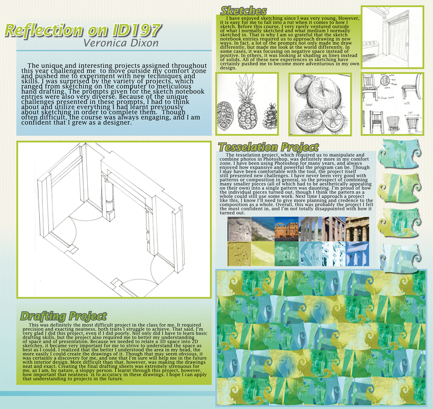
This was a poster done for my Interior Design 197 studio class. It was very difficult trying to find room for all of the many elements while still keeping the related content close together. While I like the density and arrangement of the right side of the page, I had a lot of trouble figuring the negative space on the right side of the poster. As a result, I think the whole piece is a bit imbalanced. On the other hand, I like how organized it feels and I think that the page has a decent flow. This sort of project is very difficult for me because I don't have a lot of practice with composition or graphic design in general, but I was glad to have the experience. Though not p0erfect, I'm happy with the result.
0 Comments
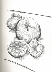
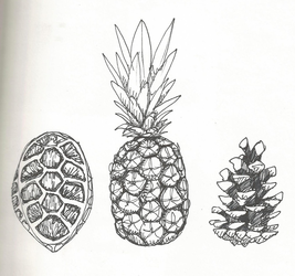
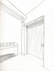
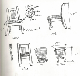
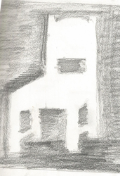
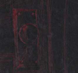
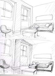
(Click each photo to see individual reflections) These are all the sketch assignments done for my Interior Design 197 studio. I really enjoyed doing these, and they were always a challenge. I liked that each prompt was purposeful, in that they explored a unique way of sketching or looking at a space. For example, the sketch in which the focus was on drawing the negative space around the chair rather than the chair itself pushed me to not only draw something differently, but to think differently about the chair itself. I'm normally not very adventurous in my sketching, so these were a welcome push out of my comfort zone. I hope I can continue to try new things in my drawing even after this course.
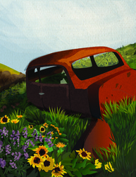
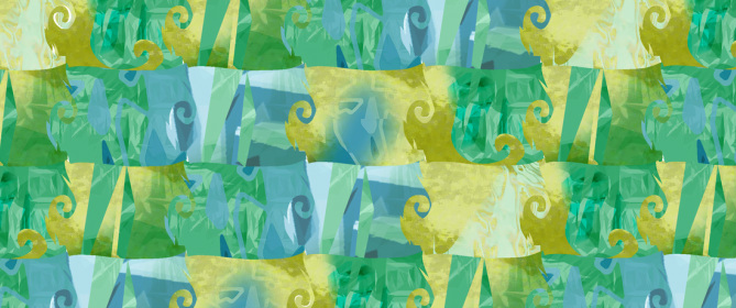
 Another project done for an Interior Design class. The prompt was to find and edit images from a specific time period and stylize them, then use those images to create a tessellation pattern. My time period was 6th century Greece. I like how the colors turned out. I wanted to use the colors of ancient Greece- the blue beaches and the stone buildings. I enjoyed stylizing the images, and felt much more in my element with Photoshop. The pattern was also fun to create. A made a template of the main tessellation shape, and then arranged, edited and cut the photos in different ways to fit into that shape. 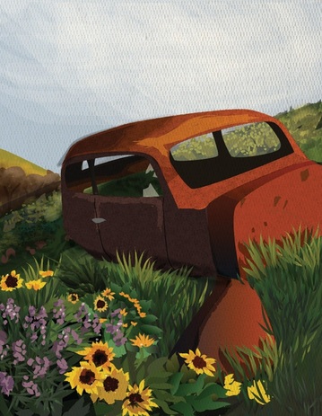 This was project in one of my Interior Design courses here at WSU. The goal was to trace and stylize a photograph of the natural area around Pullman using Adobe Illustrator. The original photo was a gorgeous shot of a rusting car surrounded by sunflowers. This was my first time using Illustrator for more than a few seconds without giving up. It was frustrating, but I'm really happy this project forced me to figure out some of Illustrator's functions. My favorite feature became the convert stroke option, which allowed me to make the simple strokes into shapes to allow for more hands-on editing. I also used gradients quite a bit on the grass. The project was very fun, and I certainly learned quite a lot. 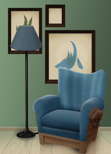 This room is meant to evoke the feelings of being on a sea shore. The smooth, bare walls combined with the detail of the chair reflect the patterns of the actual shore (the smooth sand and the clumps of shells and seaweed.) I don't really like the shape of the chair's back, and I certainly don't like the colors. I had played with them for a while before finally settling on these. I'm not sure the wall and chair color go together, but I'll keep trying until I can get it right.
|
About Me
Archives
April 2013
Categories
All
|


 RSS Feed
