|
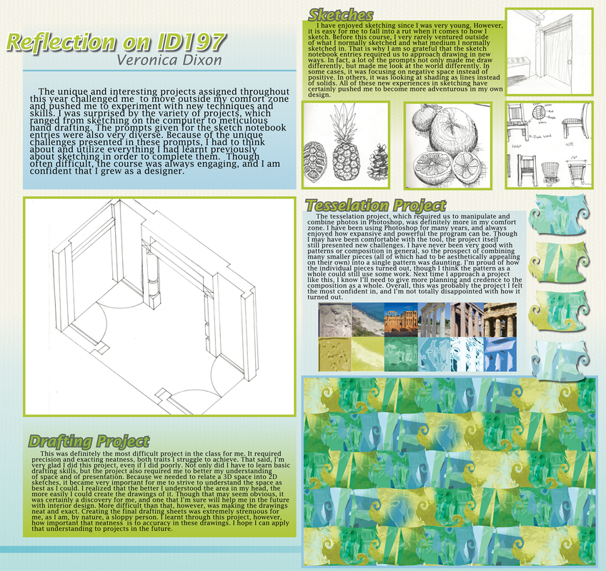
This was a poster done for my Interior Design 197 studio class. It was very difficult trying to find room for all of the many elements while still keeping the related content close together. While I like the density and arrangement of the right side of the page, I had a lot of trouble figuring the negative space on the right side of the poster. As a result, I think the whole piece is a bit imbalanced. On the other hand, I like how organized it feels and I think that the page has a decent flow. This sort of project is very difficult for me because I don't have a lot of practice with composition or graphic design in general, but I was glad to have the experience. Though not p0erfect, I'm happy with the result.
0 Comments
Leave a Reply. |
About Me
Archives
April 2013
Categories
All
|

 RSS Feed
